German regulations may have something to do with the fact that personal computers initially looked beige in most cases. (Image: stock.adobe.com – Suresh Heyt peopleimages / BOOCYS)
Advertisement
This much can be revealed right at the beginning of this article: We couldn't find a clear answer to the question of why PC cases used to mostly look beige.
But there are interesting explanations for this – and one of them even leads to Germany.
Which exactly means earlier
? We are talking here about the early days of personal computers, especially the 1980s and 1990s.
Advertisement
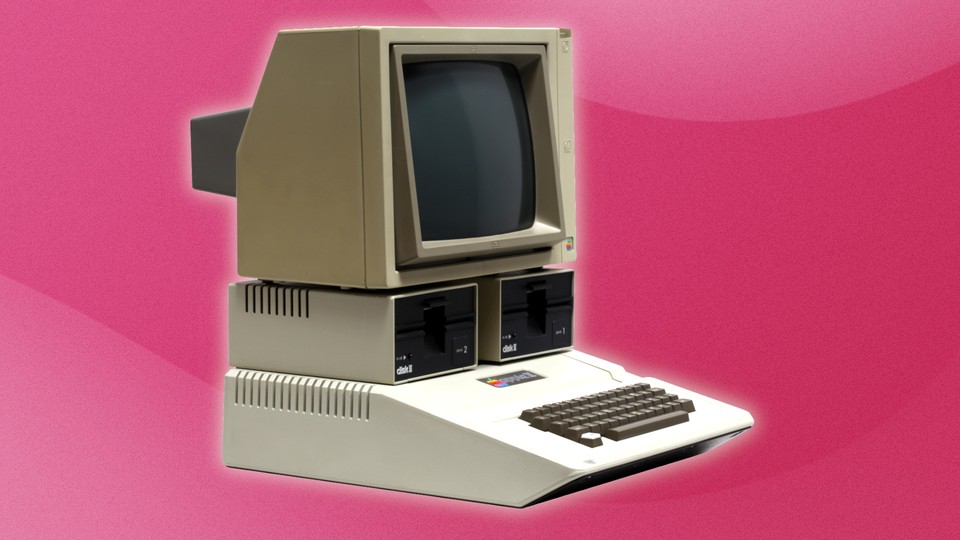
The legendary Apple Computer 2 from 1977 in all its primarily beige glory. (Image: Wikipedia)
- One of the many theories about the dominant color scheme at the time is that other manufacturers were based on the Apple 2 computer, which was released in 1977. You can see him in the picture above.
- Nowadays there are hardly any PCs in beige anymore. Instead, most models are black, have glass window(s) and rely on (RGB) lighting.
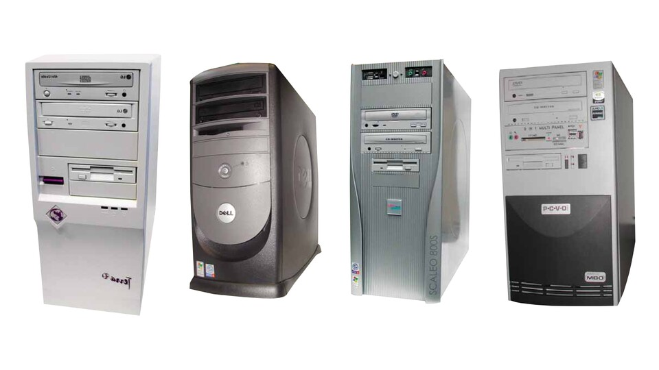
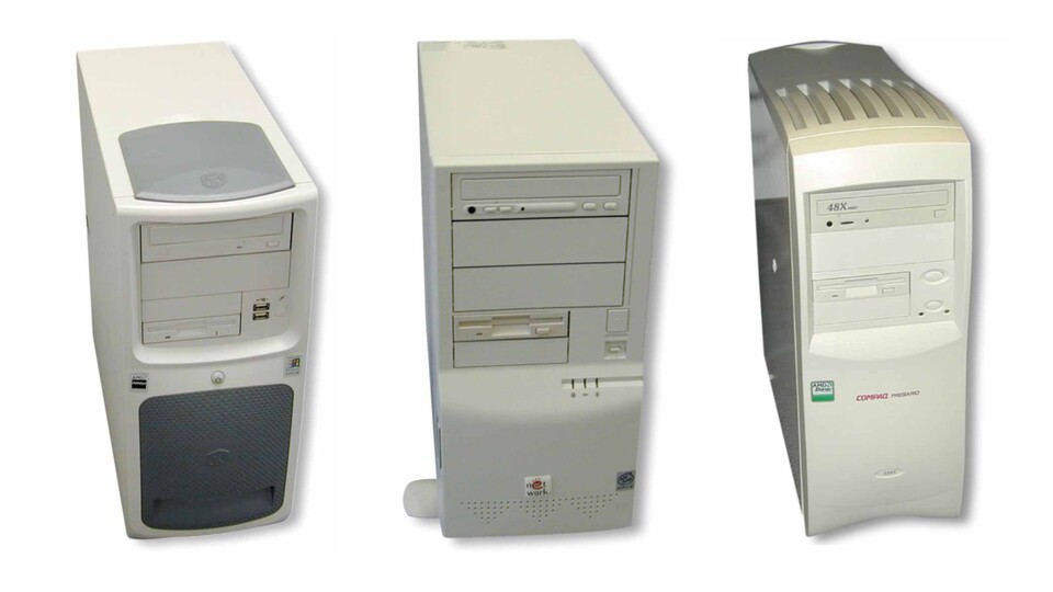
- A look at old GameStar editions shows how long beige was the color of choice. In issue 12/2000 we tested three complete PCs, all of which were primarily beige. Two years later, you can still see a lot of beige, but also other colors such as white, black, gray and silver.
The move away from PCs with beige cases slowly began around the beginning of the 2000s.
Why a trail leads to Germany
When we were researching the reason for the dominant beige color on old PCs, we came across an article by Gizmodo bumped. He brings up workplace standards in Germany at the time as a possible explanation.
- The background is the book ThinkPad: A Different Shade of Bluewhich is dedicated to the origins of IBM's well-known ThinkPad brand.
- According to the authors, IBM was one of the first manufacturers to break away from the beige color scheme with its ThinkPads in the 1990s.
- As a background for the widespread use of this color scheme, they state the following translated in the book:
In the late 1970s, Germany introduced workplace standards requiring “bright” colors on office computers. These standards were soon adopted by other European and Scandinavian countries. Then, in the 1980s, all colors other than gray and off-white were virtually eliminated throughout the computer industry for cost reasons and European workplace standards.
In order to find out exactly what standard this could be, we wrote to various official bodies.
These include, among other things: Federal Archives and the Federal Institute for Occupational Safety and Health.
Possible solution to the puzzle
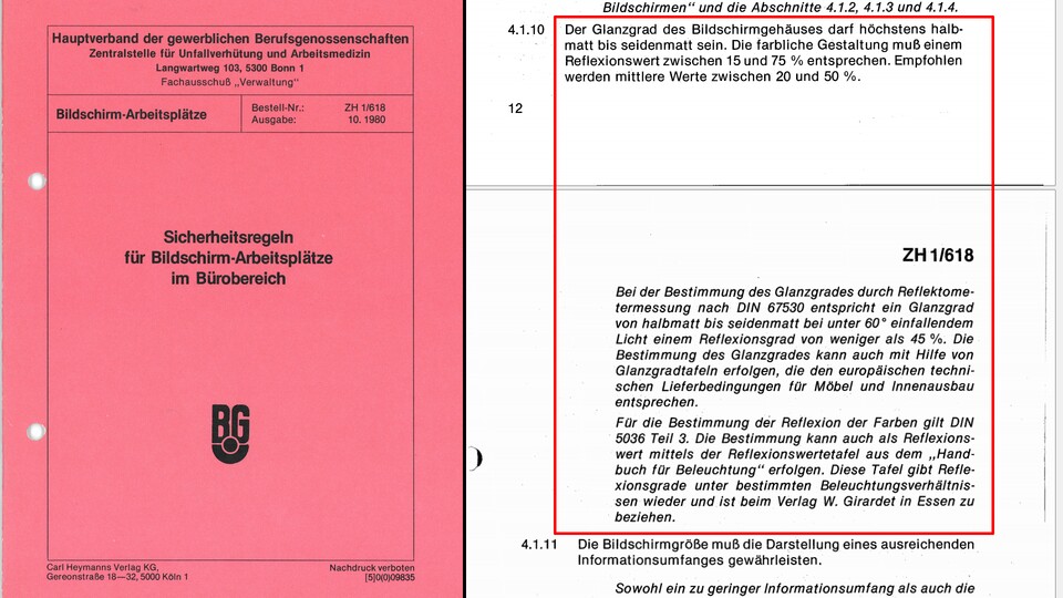
In the area marked in red, this document on safety regulations from that time discusses the “level of gloss” of housings.
Ultimately, it potentially hit the mark German statutory accident insurance. This is about the writing seen above Safety rules for computer workstations in the office area
the main association of commercial professional associations.
- The document under the number ZH 1/618 comes from October 1980.
- It requires that when designing the color of screen housings, the degree of reflectance should be between 15 percent (rather dark colors) and 75 percent (more light colors).
- The document also contains an identical requirement for keyboard housings.
The aim was to ensure that the housing in the workplace neither reflected too much light nor absorbed too much of it, which would speak against white and black, for example – but in favor of beige.
How binding were these rules? Andreas Stephan, head of the department at the, comments on this statutory accident insurance to us as follows:
As a safety rule, ZH1/618 was quite binding at this time. When the Occupational Safety and Health Act came into force in 1996, entrepreneurs were given the opportunity to choose other solutions as part of the risk assessment if at least the same safety and health protection for employees is achieved.
- The recommendations from that time have survived to this day in a less binding form: they can still be found in the current DGUV Information 215-410
Computer and office workstations – guidelines for design
more specifically on page 74. - The Federal Institute for Occupational Safety and Health tells us something similar. So it is said that they
We currently and have long been recommending light colors for computer and office equipment. This is considered standard for professional use
.
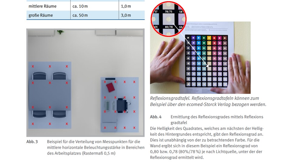
The picture shows an excerpt from the publication “Lighting in the Office – Help for planning artificial lighting in offices” from the DGUV. The color chart shown on the right can help determine colors with appropriate reflectance values.
Couldn't there have been colors other than beige? Basically yes, because a suitable level of reflectance can also be achieved with other colors such as green. This is shown, among other things, by the reflection value table that you see in the picture above.
However, there are several reasons that speak against the use of bright colors. Stephan from DGVU brings up the following, obvious aspect that makes beige colors a good choice:
This is probably because these colors are relatively neutral and can be combined well with other colors in the room (floor, walls, ceiling).
An explanation that also appears elsewhere, as the following article section shows.
What do important manufacturers from back then say?
We contacted big names who were among the first important manufacturers of personal computers at the time. In addition to IBM and Dell, this also includes Hewlett-Packard.
- IBM: The German press office only states that it has no further information about the color scheme at the time.
- HP: They are still working on tapping a promising internal source from the USA. If she provides interesting details, we will update this article accordingly.
- Dell: This manufacturer is the only one to have given us a specific answer so far. We caution that the following statements from a member of the US design team are assumptions and not verifiable facts. But they are still interesting:
Back in the “beige” days, there wasn't really much attention paid to aesthetic design… it was primarily about the technology. Since most early computers were designed for commercial use, I assume they didn't want anything to clash with the neutral office environment. It was mostly a piece of furniture.
[…] All of the beige desktops we started with were stamped sheet metal cases that needed to be painted. The panels were molded plastic so I assume beige was the solution to get a good match.
The question of material comes into play again when we finally look at other possible explanations for the long dominance of the color beige.
A quick look at other possible explanations
Even if the German safety regulations at the time support the color beige, it is unclear how big its global influence on the color scheme of PCs really was at the time.
Other explanations for the mostly beige cases we came across:
- Material and costs: Beige ABS plastic was the most commonly used material for computer cases during this time. It was relatively inexpensive, easy to process and offered good durability.
- Marketing: Computer manufacturers may have believed that beige cases made their products look more serious and professional.
- Technology: The CRT monitors used during this time radiated a lot of heat. Beige cases reflected this heat better than other colors, helping to keep computer cases cool.
- Zeitgeist: In the 1980s and 1990s, pastel colors were generally very popular, and beige was one of the most popular pastel colors.
- Uniformity: Colorful and different colors of PCs could have caused envious glances and the desire for a different work device.
- neutrality: Colors such as red or green have the potential to have (negative) effects on people's moods and could make someone feel uncomfortable or intimidated.
- Cleanliness: Dirt tends to show up more quickly on a white case than on a beige one.
In the end there probably isn't the
an explanation for the fact that computers used to mostly look beige. Instead, several factors seem to have ensured the dominance of this color.
But the beige of old PC cases is not the only color of technology that raises questions.
We address another exciting question in this context in the article at the link above. Or can you spontaneously say why circuit boards for PC hardware were always green for a long time?